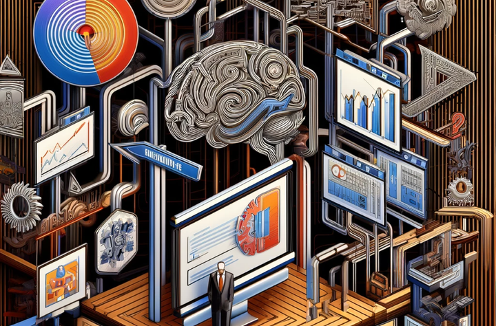
Cognitive Load & Information Communication
Beyond Aesthetics - A brief primer on the cognitive and psychological foundations of effective data visualization & information communication.

'Pretty' Means More than Just 'Pretty'
In a data-driven world, the ability to effectively communicate complex information is invaluable. Sure, "data is the new oil" 1; both data and raw petroleum need a lot of refinement to be made useful and profitable. But unlike oil, data requires more than mere processing; It requires context, analysis, and interpretation. This is where design comes in to play.
A "pretty" data visualization or "clean" looking text block or table may be more than visually appealing. Information design is not merely an art; it's a science grounded in cognitive psychology, attention theory, and decision-making research.
Cognitive Load and Data Visualization

The concept of cognitive load theory, first popularized by John Sweller in the late 1980s, serves as a critical framework for understanding how human cognition works during learning processes.
In its most simplified form, cognitive load theory posits that human working memory is limited, and that effective learning and decision-making are constrained by the amount of information we can process simultaneously 2. This is why its so hard to cram for an exam - you can only absorb so much at one time.
Cognitive load theory is broken into three components 3:
- Intrinsic Cognitive Load: this is the inherent complexity associated with the material being learned or presented, and is related to the subject matter itself. This is just "how hard it is to learn". The intrinsic load of a specific topic is generally unchangeable - it is easier to learn addition than it is to learn how to calculate differential equations.
- Extraneous Cognitive Load: this is the additional cognitive load imposed by the way information is structured, presented, or the learning environment itself. It represents the unnecessary mental effort required to process information that is not directly relevant to the subject matter. While most people think of this as data visualization, it can also be the structure of a report, the scaffolding of a table, or the readability of a font selection. Your job as a presenter or teacher is to lessen the extraneous load as much as possible so you can maximize the impact of other two load types.
- Germane Cognitive Load: This is the mental effort applied to learning the task itself, or the specific brain power used to organize information in the head, anchor it to existing and relevant existing schema, or create new schema and mental models. This is where a concept is integrated into long-term memory and made available for recall later.
So how do we leverage these concepts in our data visualization, reports, and presentations or lectures?
Controlling Intrinsic Load
Sorry. You can't do much about intrinsic load - something is complex or it isn't - your delivery methods and styles won't impact much here. Unfortunately, there is no way to teach calculus without understanding basic arithmetic and algebra. Let's move on.
Controlling Extraneous Load
Out of the Cognitive Load schematic, this is where you have the most control. Your goal here is to set the scaffolds for your audience to be able to move around within the information without losing their train of thought. Think about "gut impact" of visuals, or "simplicity of message".
Say I'm developing a data visualization for a report. I try to put myself into my "laziest" (or most distracted) brain state and try to see what the one thing I want someone to take away from my data viz, and see if it hits. Think "red = bad", or "big is greater than small". Distill it way down to its core, and then build from there.
Let's talk about simplicity.
As Simple as Possible (but No Simpler)
In data visualization and information design, this principle is critical: overload your audience with too much information, complex visual structures, or intricate details, and you risk diluting the message you aim to convey.
For instance, a visualization filled with unnecessary decorations, often called "chartjunk," can increase extraneous cognitive load, and may lead to a less effective presentation of data 4. This is the classic 'Edward Tufte' view of data visualization that you tend to hear in many data visualization courses 5. You may also have heard about this as an 'information to ink' ratio, or something similar.
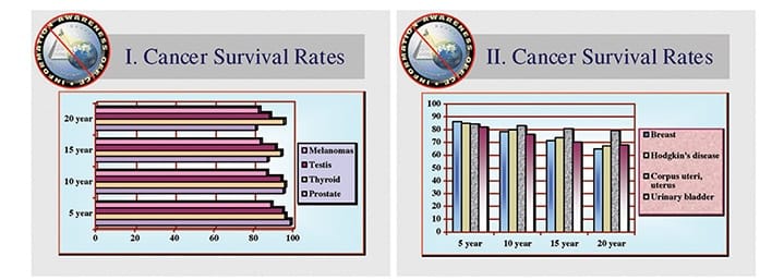
On the other hand, an overly simplistic visualization might not adequately represent the complexities of the data, thus under-utilizing the available cognitive resources and possibly leading to overly simplistic conclusions. You also may be accused of 'hiding important information' and lose some of your audience's trust.
Unless You're Like, Really Good
If that weren't complicated enough, enter: The Infographic. Infographics tend to lean harder into the art side and/or journalism side of things.
On the journalism side, you have probably seen some gorgeous visualizations from brilliant and creative people like Alberto Cairo or Mona Chalabi. You can also explore the Tidy Tuesday creations from people like Cedric Scherer, who thread the needle between art, science, and communication in clever ways.
These visuals don’t totally obey the “Classic Tufte Method”. But also no one can say these visuals do not draw you in, teach you something, and leave you with something interesting to chew on for a while. They are incredibly effective. If you look hard enough, the core ideas are rooted firmly in the foundations; the cleverest people know exactly how to break which rules and when.
Balancing Art and Science
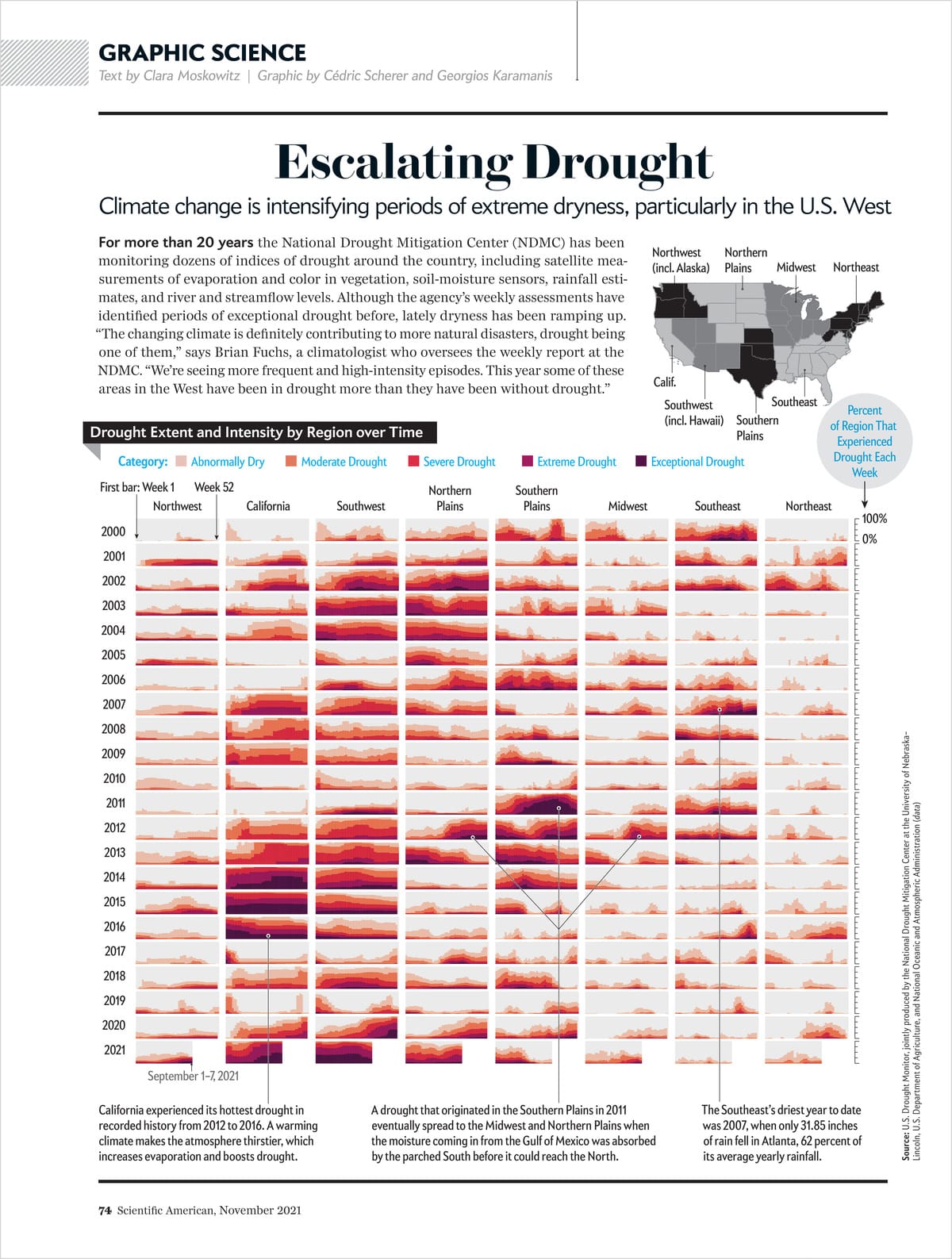
Effective visualizations strike a balance; they are rich enough to convey the necessary complexity of the data while being simple enough to be quickly and easily understood. If they incorporate artistic flourishes, those serve to draw you in and keep you there, and are put in with surgical precision to stay out of the way of the information itself.
The best communicators use several different encoding mechanisms - balancing extrinsic load across systems that process color, text, pattern, movement, and more - to deliver more information in a more digestible way. This sweet spot makes the most efficient use of our cognitive resources, ensuring that the message gets through clearly and memorably without unnecessary mental strain.
Controlling Germane Load
When you think of Germane load, think "anchor" and think "narrative".
Failures of controlling germane load can be seen across thousands of high-school students who can recite important historical names and dates for like an hour after cramming for that exam, but six months later can't remember any of it. Rote memorization is anathema to long-term learning. If you can't tie some new thing to some existing thing in your brain, it will be much harder to retrieve that new piece of information later.
Narrative helps immensely in the process of converting short-term to long-term memory.
Narrative and Memory
Humans are storytellers by default and have been for at least 30,000 years 6. It’s how we communicate best. We are simply wired to remember stories better than lists of facts, and this insight can be instrumental in the realm of data communication 7. Jerome Bruner, a cognitive psychologist, posited that narratives up to 22 times more memorable than facts alone (Bruner, 1991). This underscores the importance of incorporating story elements not just into reports and presentations, but to weave it into your data visualizations as well.
The reason storytelling is so effective lies in its structure. Most narratives have a beginning, middle, and end, allowing the audience to follow along a ‘path’ which organically leads to the key message or conclusion.
Presentations tend to start with a ‘where we were’, to a ‘what we did’ to a ‘what’s next’ section. Scientific articles tend start with an introduction, move to materials and methods, into a discussion and conclusion, and then suggest further research. Your tables and data visualizations tend to have an informative title on the top left, and progress to the smaller details in captions on the bottom right (in reading order across a page).
This temporal progression helps the audience to grasp the urgency and also the possible ramifications, allowing the data to be contextualized and thus, better remembered.
Choose Your Own Adventure: The Role of Interactivity
Interactivity is another dimension that can elevate your data communication strategies. Interactivity enables the viewer to explore the data by themselves, enhancing their understanding and retention of the information presented. A study by Yi, et al. demonstrated that interactivity significantly improved viewers’ ability to acquire insights from visualizations 8.
In today’s digital age, the opportunity for making data visualizations interactive is more accessible than ever, through tools and platforms that allow zooming, filtering, or even real-time updates. For example, instead of just showing a static map of volunteer and donation rates for your non-rofit, an interactive map could allow users to zoom into their local area or filter by various demographic factors. This not only keeps the viewer’s attention but also makes the information more relevant to them.
Moreover, interactivity can serve to guide the viewer through complex datasets, in a manner somewhat akin to an interactive narrative. By allowing viewers to ‘unearth’ facts and trends themselves, you engage them in a form of ‘active learning,’ which is shown to be more effective for retention and understanding 9.
Both narrative storytelling and interactive elements can captivate the viewer’s attention, which is an increasingly scarce commodity in our information-saturated world. Used judiciously, these techniques can turn a dull report into a compelling story, and a static chart into an exploration, ensuring that your important data isn’t just seen, but also understood and remembered.
Conclusions
Effective data visualization and information communication are not merely a matter of aesthetics. It is a multifaceted discipline deeply rooted in cognitive science, psychology, and ethical considerations.
The true beauty of a “pretty” data visualization lies in its ability to efficiently communicate complex information, provide context, evoke the right emotions, narrate a compelling story, and engage the audience interactively—all of which is backed by rigorous scholarly research. The aim is not just to make data visually appealing, but to transform it into a strategic asset for decision-making.
So, the next time you look at a data visualization and think it’s ‘pretty,’ ask yourself why. Is it just visually appealing, or does is the sum of it somehow greater than all of its parts? Chances are, if it’s genuinely effective, it’s much more than just a pretty picture.
Footnotes & Citations
1. Bridle, James. New Dark Age: Technology and the End of the Future. Verso Books, 2018.
2. Sweller, J. (1988). “Cognitive load during problem solving: Effects on learning.” Cognitive Science.
3. Note that Cognitive Load Theory is a bit of a leaky abstraction, however it is useful in the planning of information communication and data visualization when considered in concert with audience and environment specifications.
4. Bateman, S., Mandryk, R. L., Gutwin, C., Genest, A., McDine, D., & Brooks, C. (2010). Useful Junk? The Effects of Visual Embellishment on Comprehension and Memorability of Charts. ACM CHI, 2573–2582.
5. Tufte, E. R. (1983). The Visual Display of Quantitative Information. Graphics Press.
6.Smith, D., Schlaepfer, P., Major, K. et al. Cooperation and the evolution of hunter-gatherer storytelling. Nat Commun 8, 1853 (2017).https://doi.org/10.1038/s41467-017-02036-8
7. Cooke, Ed. “How Narratives can aid memory”. The Guardian. https://www.theguardian.com/lifeandstyle/2012/jan/15/story-lines-facts
8. Yi, J. S., Kang, Y. A., Stasko, J. T., & Jacko, J. A. (2008). Toward a deeper understanding of the role of interaction in information visualization. IEEE transactions on visualization and computer graphics, 13(6), 1224-1231.
9. Chi, M. T., & Wylie, R. (2014). The ICAP framework: Linking cognitive engagement to active learning outcomes. Educational Psychologist, 49(4), 219-243.
